For now I figured I can share my kitchen design, and hopefully that will help you in designing your own space. Our kitchen is so close to being done and I can not wait to share the final result. As I have said before my goal for this year is to finish projects we have already started. The kitchen is high on the list of projects to finish. We only have a few things left to do:
- Coffee Bar Counter
- Sand & Paint Ceiling
- Crown Molding
I think that about sums it up. Nothing too crazy hard, we’ve already done the hardest things. So hopefully I will be posting the finished results here soon.
How it Started
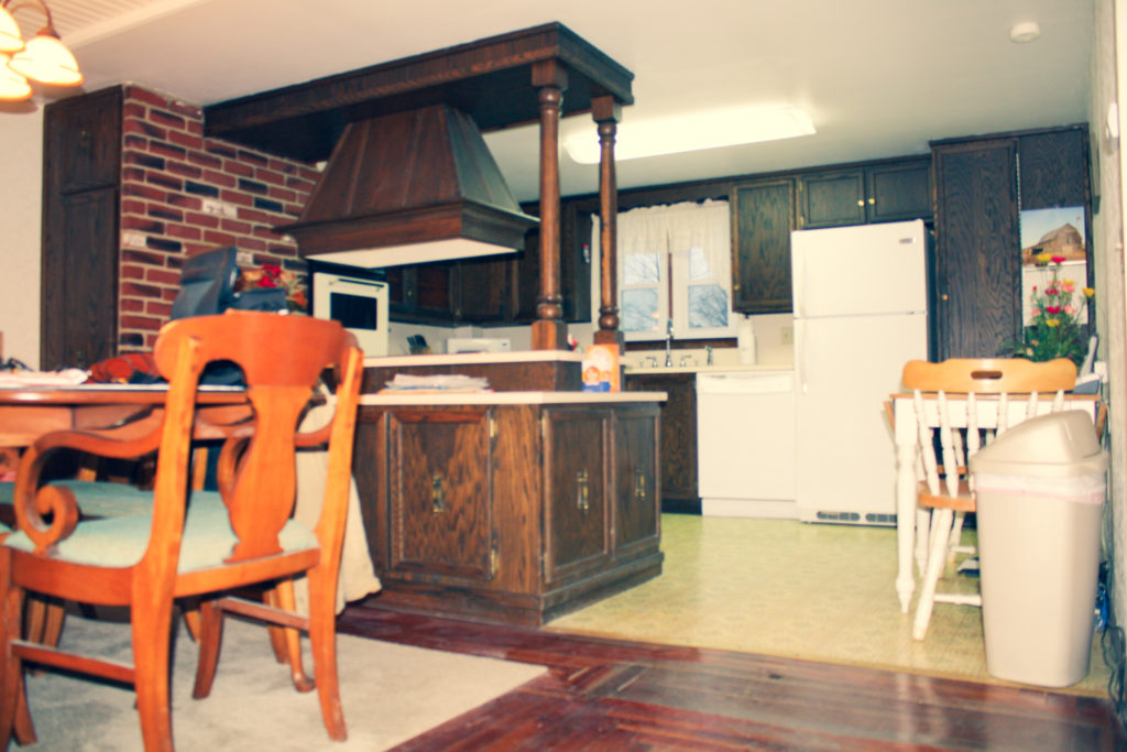
In order to design a space you need to know what currently does not work in that space. As you can see above when we moved into this space it was dark, dated and dingy.
The vent hood was probably the worst offender. It interfered majorly with sight lines to the dining room, and more importantly the food being cooked on the range. The oven in the make shift “brick” wall was a bit small for us too.
The next offender to me was how the dishwasher and refrigerator were right next to each other. Usually there’s at least one cabinet between, this was more of an aesthetic issue than a functional one. Also speaking of aesthetics the linoleum was pretty sad and discolored.
Kitchen Design
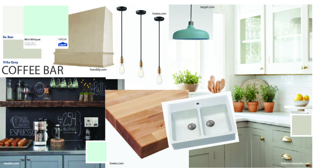
How to Design a Kitchen
When doing a kitchen design there are a few things you want to keep in mind:
- Lighting
- Color Scheme
- Counter tops
- Work Triangle
- Hardware
- Cabinets
- Appliances/Fixtures
Making a design board of all of the items can really help you get an idea for how the space will look when done. It’s a good idea to make sure everything plays well together before putting any money and time into it. Not to mention it’s kind of fun to daydream and put a design board together.
Kitchen Design-Lighting
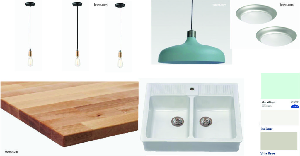
For overall lighting we took out the large rectangular box light and were able to put in two little flush mount lights. They kind of disappear on this low ceiling which is nice. At one point on a whim we found a track light that we liked and put it in in place of that big box light. We had a track light similar to it in our last house and it worked well in that house, but it did not work well at all in this kitchen. Our ceilings are far too low, and it just felt like spotlights everywhere.
I wanted to get the brass flush mount lights to tie in with our other light fixtures, but they were out when we went to get them. We ended up getting the stainless steel ones since they were in stock. I don’t think it’s that big of a deal since we have stainless steel appliances, they still work well in the space. I don’t feel like they are on the same plane of sight as our other light fixtures so I think it works out ok. Plus like I said they kind of disappear, and don’t stand out especially when on.
For task lighting we added some lights over the peninsula. We were able to take out that huge vent hood and put in 3 pendant lights. They are simple and industrial, pretty similar to the ones shown in the design plan. Our bulbs are just more round, and not so elongated. We kept with the brass to tie in the with the hardware.
For task lighting on the other side of the kitchen we have led strip lights under the upper cabinets. We installed those pretty early on, and they were a game changer.
There was also a smaller rectangular light above the sink that we removed. We put one of those metal shade lights in it’s place. It is way prettier on the eyes, and still very functional. The best of both worlds. In the picture below they show it looking like a stainless steel top but ours is actually more of a brass. I think the shade is a lighter mint in person also, closer to the mint whisper paint color we went with.
Kitchen Design-Color Scheme
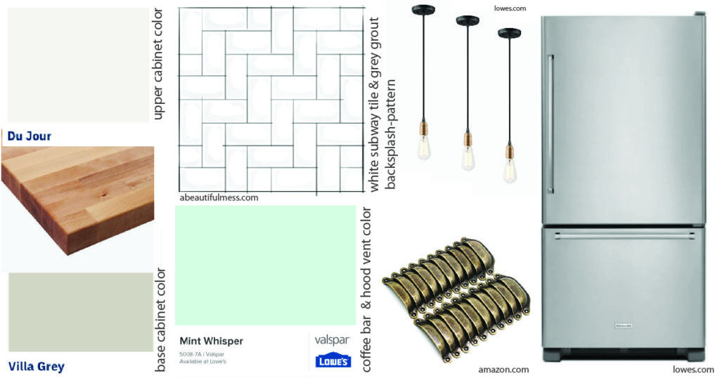
If you know me at all you know that my favorite go to color has been a green/blue for as long as I can remember. Ranging from turquoise to mint. Luckily this mint trend became a thing, and I couldn’t help but add some pops of mint into my color scheme for this kitchen. I still want it to be fairly classic though. I don’t want to be redoing it 5-10 years from now to follow the latest trend.
So I stuck with a classic white and warm grey. To make this classic a little more interesting I decided to do the uppers white and the base the warm gray. For that pop of mint I figured the breakfast bar would be a good spot. It would be easy enough to repaint those few cabinets if I get tired of it.
When we put the vent hood in I wasn’t sure whether I was going to stain the hood vent or paint it. After figuring out what materials I was going to use I ended up having to paint it. At first i thought about continuing the white upper color, but I decided to add some more of the mint. Since the mint hood is on the opposite side of the room as the mint coffee bar cabinets, they balance each other out nicely.
Kitchen Plan-Counter Tops
We went back and forth on what to do for the counter tops. We wanted something budget conscious, but we still wanted it to look good. With the white, mint and grey being cooler tones we thought butcher block would add a nice warmth to the kitchen. It does make it way more welcoming, the cabinets almost feel like another piece of furniture.
We know that they won’t be in mint condition for long. Actually they already have some discoloring and scratches, but it adds character and charm. At this point I’m very happy with the result, and think they are a great budget friendly option.
For the coffee bar we talked about continuing with the butcher block, but I think we are going to change it up. It is a wet area, and I think it would be fun to do something different. I’m still on the fence whether we will do a concrete finish or stainless steel. I am leaning towards a concrete finish, but we will see.
Kitchen Plan-Work Triangle
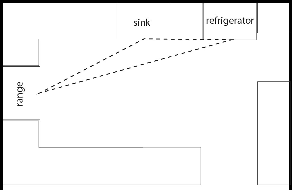
This is arguably one of the most important steps when planning your kitchen renovation. Designing an optimal work triangle helps make your kitchen super functional. The location of your range, sink and refrigerator make up the 3 points of the work triangle.
You want the points to be far enough apart so you have different zones for each of those tasks that go with those appliances/fixture. At the same time you don’t want them to be too far apart. For example you don’t want to take a pot of pasta from the stove to drain in the sink on the opposite side of the room.
Our triangle works really well for us. We thought about putting a range back where our old one was, but there were two things that bothered me about this. First I plan on putting a built in bench on the other side of this peninsula, and I do not want the kiddos standing up there and burning themselves. Also I don’t want to be accidentally splattering people with bacon grease or something. The second thing being that we wanted a vent hood, and the easiest way to do this was putting it on that wall as shown.
Also I just love how much prep space we have on the peninsula now. It’s so nice with the kiddos to have space for them and I to work. Also at Christmas time it’s so nice to have so much counter space when we get together and make cookies. These are the things I had in mind when designing this space, and it’s the best to see it play out as I had hoped.
Kitchen Plan-Cabinets
The original cabinets we had were in really good shape, and seem to be good quality. I didn’t mind the look of them either other than them being too dark in my opinion. Especially in this space we didn’t seem to get that much light for a south facing window. So obviously paint is an easy solution for that.
The layout was also a bit wonky with the dishwasher right next to the refrigerator, and the weird wrap around lower cabinets on the peninsula. We took those weird wrap around cabinets and made the main ones into a coffee bar. The shallow one on the end we just removed completely. I’m not sure where we will end up using it. Maybe in another room.
I could do a whole post on how the cabinet layout changed, and maybe I will. The gist of it is we moved some cabinets around. We took out some cabinets, and we built new ones for the trash/recycling. If you are able to use the cabinets you have in your kitchen design I think it is well worth it. Cabinets add up fast.
Kitchen Plan-Hardware
I was lucky enough to save some money here. We kept the knobs that were already on the cabinets. I wanted pulls for the drawers though. Luckily I was able to find some pulls that look like an aged brass similar to the knobs. They were on Amazon and very price friendly. I used to be a stainless steel or black finish only fan, but the warmth of the brass has really grown on me while living here. It feels a little more boho also, which I like.
I did not care for the fanciness of the old brass pulls on the coffee bar cabinets. I especially did not like them in the middle of the cabinet doors. When I removed the hardware I realized they were two pieces, and that without the back plate they weren’t so bad. So I moved those pulls to the top corner of the doors on the coffee bar, and I’m pretty happy with them. I’m very happy that I didn’t have to buy anymore hardware.
Kitchen Plan-Big Ticket Items
Before we even signed the papers on this house we decided we wanted a farmhouse sink. An old farmhouse needs a farmhouse sink, and that’s what she got. After shopping around we found one we liked for a decent price at Ikea. If I remember correctly I think we bought it before we even moved in.
Since watching my husband and FIL install it, and learning and doing millwork drawings for people I think I should have paid more attention to the specs. In hindsight I think we could have done some more measuring and maybe found an easier one to install in our existing space with our existing cabinets. Instead of just going on what we liked and could afford. I do love what we ended up with, I just know it was a lot of work to get it to this point. Possibly more work than necessary. In other words, work smarter not harder and pay attention to those spec sheets.
As far as appliances go, I liked the idea of the dishwasher, oven and refrigerator blending in a bit with the grey base cabinets. I like the commercially (is that really a word?) look of stainless steel and how reflective it is. I wish the price tag was a bit less. In my opinion it’s worth it to splurge on items that are important to you, you just have to prioritize.
I hope you were able to find some jumping off points for your own kitchen design. If you are looking for help while designing your own space you can find information on my design your space ebook here. Thank you for visiting our farmhouse. If you missed our house tour you can find that here. Feel free to look back at some of our other posts to help inspire you in creating the home of your dreams.
